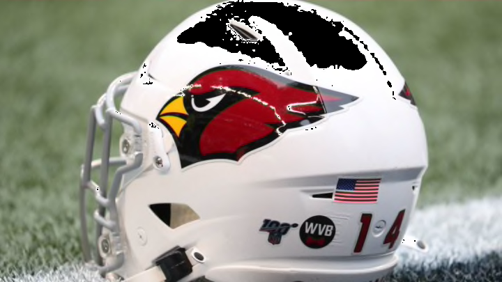
Uniform reboots have been numerous this offseason. One graphic designer takes a look at what the Arizona Cardinals could do to freshen what some fans feel is a stale look.
The 2020 NFL offseason has been anything but quiet. While every sports league imaginable has hit the pause button, football has rolled-along. With the draft and free agency being a hot debate topic, one other topic has as well: uniforms. With the Los Angeles Rams, Atlanta Falcons, Tampa Bay Buccaneers, and Los Angeles Chargers introducing new gear, fans of the Arizona Cardinals wonder if they might be next.
For reasons not complicated to understand, uniforms are always hot among sports debate. Love them or hate them, any new rollout is a big deal. If an organization hits the mark, it’s like winning on opening weekend. Miss the mark, and the recoil from fans can be massive. One example of late is in Los Angeles, where the Rams managed to take an iconic look and miss big.
https://twitter.com/RamsNFL/status/1260583872762449920
In Arizona, the idea of a uniform refresh isn’t new. In fact, Cardinals quarterback Kyler Murray has weighed in with a vote. He simply doesn’t like them. “No, I don’t like our uniforms,” Murray said. “They’re outdated.”
Like them or not, it’s not illogical to think that the Cardinals might eventually be on a timeline to update, or refresh the current look. Social media, which can be a good place to gauge interest, has seen fans indicate the time for new unis is upon us. Additionally, graphic designers and artists can drive the discussion with their own versions. Some do well, some not so much.
One graphic artist to take notice of is Mike Joseph. He recently has posted some interesting looks of what an Arizona Cardinals uniform redo might look like.
Where uniform trends are heading.
RZ – Several teams have unveiled new uniforms for the 2020 season, what is a trend you see developing in design as organizations unveil their new look?
MJ – I see more fans/amateur designers getting interested and putting their ideas out there. I think that’s a trend that spawned from the other trend of Nike doing a pretty bad job with the NBA and NFL uniforms. Everything seems to be getting boring and I think fans, especially NBA fans, are ready for a return to the 90s vibe of bold colors and designs.
RZ – You have created some interesting looks for the Arizona Cardinals. For purists like me and many other fans, how do you toe the line between what is historical and what is a modern look?
Alternate set 1 draws on the desert cardinal color palette with copper added since we're the Copper State. Also a nod to AZ firefighters. Set 2 is an Salute to Service Army Ranger edition honoring Pat Tillman and our service men and women. pic.twitter.com/VOAMXLa9m9
— Suns Uniform Tracker (@SunsUniTracker) May 23, 2020
MJ – I try to listen to fan feedback on previous designs I’ve done or just on social media in general. I’m not afraid to try anything because they’re just concepts and part of the fun is getting reactions. That being said, I think NFL uniforms do look best when kept simple and classic, with a little touch of modern here and there.
What the Arizona Cardinals could look like in new gear.
RZ – For the Cardinals, could you see the organization taking a radical approach to color and logo design, and as a graphic artist, what would you like to see?
MJ – I don’t see it happening. Teams are very careful to maintain brand identity and big changes like that are rare. If they did make such a move, I’d love to see them adopt the Arizona flag colors or change to the desert cardinal palette.
RZ – A lot of teams introduced new looks this offseason. With a team like the Rams, who have an iconic look, you find many die-hard fans who believe the organization missed the mark. Having seen fan reaction, what would you recommend to the Cardinals?
MJ – Listen to the fans and hire me as a consultant! Lose the black – it’s overdone and is a minor part of the identity. A little trim is okay but not necessary. Get rid of the grey facemask – it’s antiquated and not part of the palette.
I actually like that the Rams took a risk, I just think they departed too much from classic NFL looks. I’ve been upset with how conservative Nike has been, so I’m glad they at least tried, but the feedback to the initial logo leaks was loud and bad and they should have listened like back when the 49ers tried to change the helmet. Teams need to be more in tune with what the fans want, and that clearly wasn’t it. I expect they’ll change that when the 5 years mark passes.
Fan reaction.
RZ – Of what you’ve designed so far, and via your social media account, what has been a consistent favorite with fans?
The beautiful AZ flag must be a part of the Cardinals identity, especially since the blue adds a needed pop color that isn't black. Highlights on the bird head and a bolder wordmark, plus some classic pant striping. Colored cuffs for a little more pop. No more grey mask! pic.twitter.com/nEdukStBnr
— Suns Uniform Tracker (@SunsUniTracker) May 23, 2020
MJ – With Cardinals fans, most people really love the flag on the sleeve. I also get lots of positive feedback on the different colored facemasks I’ve shown as options. Most fans seem to want those things from what I’ve seen.
Mike Joseph is a graphic artist who has his finger on the pulse of fans in both the NBA and the NFL. currently, he has a Jordan 1 design contest that is drawing a ton of interest. For more, check out his twitter feed @SansfordAndSuns for all his latest designs.
