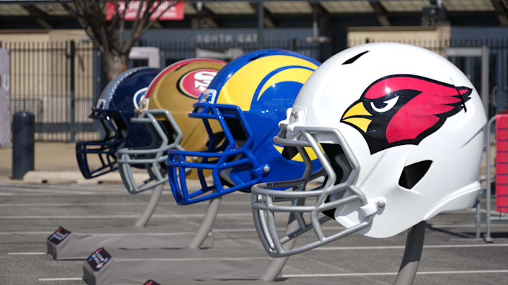
The Arizona Cardinals are the oldest professional football club in the NFL. Like any venerable institution, they need a fresh coat of paint every once in a while.
When the Cardinals unveiled their current design in 2005, it was the first major change to their logo in 45 years, an icon they adopted when the team relocated to St. Louis from Chicago in 1960. The Cardinals kept the logo when they moved to Phoenix in 1988, before opting for a new look after the turn of the century.
The new logo added a thick black outline, slimmed the bulbous head to something sleeker, and angled the bird's head to give it a sharp, steely-eyed look. The change was also meant to represent the team's new “aggressive and bold” style of play under then-coach Dennis Green.
(And then the Cardinals went 5-11 for two seasons, and Green would be out by '07.)
But, you might say, the logo has history to it! And it does! It's what the Cards wore when coach Ken Whisenhunt led them to their only Super Bowl appearance. But, since that losing effort, the only thing consistent about the Arizona Cardinals has been the logo: they yo-yo from being a 13-3 team with a possible playoff run to dwelling in the NFC West’s basement.
Heading into the 2025 season, the Cardinals will (hopefully) continue the upswing from last year. GM Monto Ossenfort has been making moves, and coach Jonathan Gannon has something to prove.
A logo redesign could be just what the Arizona Cardinals need
Would a new logo give the Cardinals the edge in their frustratingly competitive division? Probably not! The team would likely benefit more by keeping Kyler Murray healthy (while he keeps his head in the game) or by using Marvin Harrison Jr. to his full potential!
But if the Cardinals are ready to start a new chapter that pays homage to their storied history (while keeping their historic win-loss record at arm's distance), a makeover is in order.
Or, at least if this team busts out at 6-10, or defies expectations by making the playoffs, only to get bounced in the Wildcard, we might as well soothe our collective heartbreak with some new threads. (At least it gives us an excuse to buy a new shirt, right?)
There have been some amateur attempts at redesigning the Cardinals’ logo. Artist Kyle Chua gave a stab in 2022 (after the Cardinals asked him to!) The result, seen here, is one chunky bird, more grumpy than angry. It’s a bird that knows it’s 105 degrees outside in Glendale, and while it doesn’t like it, it’s glad that it’s at least a dry heat.
The problem facing any possible redesign is the team’s name itself. “Cardinals” are not intimidating. Out in the wild, a cardinal is what the other NFL birds (Eagles, Falcons, Seahawks, Ravens) would eat for a light snack. And some amateur redesigns don’t help the Cards' cause when the revamped bird ends up looking like a chicken.
Instagram user @eft.thorton’s redesign sort of solves the problem. The logo doesn’t try to make the Cardinal seem like some badass bird of prey. Instead, by emulating the shape of a football, the logo accentuates speed and skill. Ditching the gold beak is a bold choice, but it’s hard to deny that the logo looks incredible on the black helmet mock-up.
Now, we’re not suggesting that the Cardinals change up their logo whenever they’re in a “rebuilding mode.” Fans would get upset when they’d have to buy a new jersey every 2-3 years. But, if the team wants to show they’re starting a new chapter, a new logo is the way to go.
Plus, if everyone hates it, they can always bring the old one back as a retro jersey. Win-win!
